The Largest Curatorial Library
With Responsive Swipe

RoyalSlider – Touch-Enabled jQuery Image Gallery

RoyalSlider – Touch-Enabled jQuery Image Gallery

Royal Slider is easy to use jQuery image gallery and content slider plugin with animated captions, a responsive layout, and touch support for mobile devices. As a navigation, you can use thumbnails, tabs, or bullets. Use it as an image slider, slideshow, HTML content slider, gallery, banner rotator, video gallery, carousel, or even presentation. Developed in best practices of HTML5, CSS3 transitions are used for all animations (with fallback).

Created Aug 10, 2011 · Updated Jul 24, 2023 · ★ 4.75 (2.2K) · 34.2K sales

iPages Flipbook For WordPress

iPages Flipbook For WordPress

iPages Flipbook is a lightweight and rich-feature WordPress plugin helps you create great interactive digital HTML5 flipbooks. With this plugin, you can easily make media books for your site that empower publishers and bloggers to create more engaging content. It provides an easy way for you to convert static PDF documents or image sets into the online magazine, interactive catalogs, media brochures or booklets in minutes.

Created Aug 29, 2018 · Updated Jan 12, 2025 · ★ 4.61 (18) · 846 sales

RoyalSlider - Touch Content Slider for Drupal

RoyalSlider - Touch Content Slider for Drupal

Royal Slider is easy to use jQuery image gallery and content slider plugin with animated captions, responsive layout and touch support for mobile devices. As navigation you can use thumbnails, tabs or bullets. Use it as image slider, slideshow, HTML content slider, gallery, banner rotator, video gallery, carousel or even presentation. Developed in best practises of HTML5, CSS3 transitions are used for all animations (with fallback). Video of admin panel

Created May 3, 2015 · Updated Aug 14, 2015 · 50 sales

Leo Mega Shop Shopify Theme

Leo Mega Shop Shopify Theme

Leo Mega Shop Shopify Theme with a large banner will impress your customers when they visit your store, with a large slideshow in full-resolution, about your products’ images and the link you want to put or what you want to say. Newsletter signup pop-up notices your customers about the option to receive news via email, of course they can choose not to subscribe by clicking “Close”. This Leo Mega Shop Shopify Theme is fully responsive, that means it looks good in any device you may be using to visit the website, whether it’s a computer, smartphone, or tablet,... The Leo Mega Shop Shopify Theme is extremely Mobile friendly and Google mobile friendly. The multi-language app along with this theme is an extraordinary feature that you can find nowhere else. Now language boundary is never a problem with your customer all around the world! Also multi-currency helps your customers can easily choose a currency that they prefer. All of this is made to life by latest technologies like Bootstrap 3, SASS, HTML5, CSS3, Font Awesome 4,... And even if you don’t know much about coding, you can still use shortcodes to integrate some new customized widgets like youtube, instagram, font awesome,... onto your site. Try this Leo Mega Shop Shopify Theme now to experience it by yourself!

Created Nov 1, 2016 · 27 sales

SmartWave - jQuery Content Carousel Plugin

SmartWave - jQuery Content Carousel Plugin

SmartWave is a smart content carousel plugin with a lot of great features! Along with smooth CSS3 transitions, retina-ready controls and support for wide range of browser, SmartWave can rotate items in perspective during scroll, accelerate when you swipe faster, resize by choosing best items size and number of visible items and finally, perform “lazy loading” of images, what dramatically reduces loading time on mobile devices!

Created Apr 19, 2015 · Updated May 19, 2015 · ★ 0.00 (2) · 76 sales

jQuery Content Scroller DZS

jQuery Content Scroller DZS

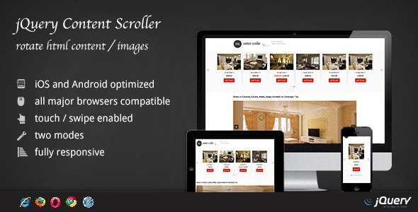
DZS Content Scroller is a solid, advanced, fully responsive jQuery plugin to scroll content. It can be a html content scroller, a banner rotator or even a image gallery due to the fact that it support inline content and it includes two viewing modes. The first one, is to automatically calculate how many elements fit in the container and then scroll them, and because it is responsive, it will auto adjust elements to your screen size. The second one is to resize only one element to fit in the container, this is ideal for galleries or cases where you need to showcase only one item on the full width.

Created Dec 24, 2025