🥇

Slidebox Mobile
High Resolution: Yes, Compatible Browsers: Firefox, Safari, Opera, Chrome, Edge, Columns: 3
Created Feb 12, 2015 · Updated Jun 27, 2019 · ★ 4.96 (24) · 537 sales
🥇
Slidebox Mobile
High Resolution: Yes, Compatible Browsers: Firefox, Safari, Opera, Chrome, Edge, Columns: 3
Created Feb 12, 2015 · Updated Jun 27, 2019 · ★ 4.96 (24) · 537 sales
🥈

20k Mobile
High Resolution: Yes, Compatible Browsers: Firefox, Safari, Opera, Chrome, Edge, Columns: 4+
Created Sep 27, 2016 · Updated Jun 27, 2019 · ★ 5.00 (25) · 374 sales
🥉

Just Mobile
High Resolution: Yes, Compatible Browsers: Firefox, Safari, Opera, Chrome, Edge, Columns: 4+
Created Apr 21, 2016 · Updated Jun 27, 2019 · ★ 4.95 (20) · 420 sales
#4

Gliders Mobile
High Resolution: Yes, Compatible Browsers: Firefox, Safari, Opera, Chrome, Edge, Columns: 3
Created Nov 9, 2014 · Updated Jun 27, 2019 · ★ 4.90 (20) · 376 sales
#5

Drag Mobile
High Resolution: Yes, Compatible Browsers: Firefox, Safari, Opera, Chrome, Columns: 3
Created Mar 24, 2015 · Updated Jun 27, 2019 · ★ 4.83 (24) · 423 sales
#6

Glovebox 3D Mobile
High Resolution: Yes, Compatible Browsers: Firefox, Safari, Opera, Chrome, Edge, Columns: 3
Created Oct 3, 2014 · Updated Jun 27, 2019 · ★ 4.92 (12) · 506 sales
#7

Pro Mobile
High Resolution: Yes, Compatible Browsers: Firefox, Safari, Opera, Chrome, Columns: 3
Created Aug 7, 2015 · Updated Jun 27, 2019 · ★ 4.64 (25) · 595 sales
#8

Around Mobile
High Resolution: Yes, Compatible Browsers: Firefox, Safari, Opera, Chrome, Columns: 3
Created Mar 11, 2015 · Updated Jun 27, 2019 · ★ 4.91 (11) · 194 sales
#9

Tinybar Mobile
High Resolution: Yes, Compatible Browsers: Firefox, Safari, Opera, Chrome, Columns: 3
Created Apr 8, 2015 · Updated Jun 27, 2019 · ★ 4.89 (9) · 214 sales
#10

Materialish Mobile
High Resolution: Yes, Compatible Browsers: Firefox, Safari, Opera, Chrome, Edge, Columns: 3
Created Nov 24, 2014 · Updated Jun 27, 2019 · ★ 4.86 (7) · 290 sales
#11

Translucent - Responsive Banner Rotator / Slider
30 Nov 2011 - Supports loading images from External Domains - Added option to Resize Images automatically - Option to choose resize behaviour (Fit or Fill) - Option to choose Image Alignment - Option to set custom number of images to Preload - New variation (Sample 5) added for easier customisation - Few minor Bugs fixed on the navigation
Created Nov 15, 2011 · Updated Sep 5, 2015 · ★ 4.66 (197) · 2.1K sales
#12

Touch N Swipe Gallery jQuery Plugin
TouchNSwipe is a responsive, flexible and easy to setup jQuery gallery plugin for mobile and desktop that supports touch gestures such as pinch to zoom, drag and swipe.
Created Oct 20, 2013 · Updated Jun 22, 2020 · ★ 4.52 (29) · 919 sales
#13

SmartWave - jQuery Content Carousel Plugin
SmartWave is a smart content carousel plugin with a lot of great features! Along with smooth CSS3 transitions, retina-ready controls and support for wide range of browser, SmartWave can rotate items in perspective during scroll, accelerate when you swipe faster, resize by choosing best items size and number of visible items and finally, perform “lazy loading” of images, what dramatically reduces loading time on mobile devices!
Created Apr 19, 2015 · Updated May 19, 2015 · ★ 0.00 (2) · 76 sales
#14
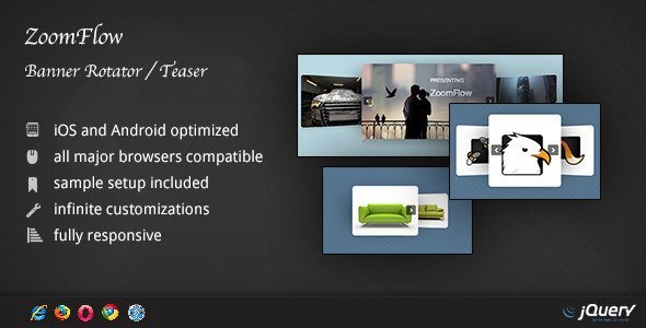
ZoomFlow - Banner Rotator / Teaser
ZoomFlow – Banner Rotator / Teaser is a spectacular banner rotator to showcase your portfolio. It’s a solid, advanced and fully responsive jQuery plugin. Easy to install and compatible with major browsers, including IE, ZoomFlow it’s the perfect plugin for your portfolio. Also, it’s iPhone / iPad compatible and optimized, it looks great on mobile and tablets.
Created Dec 24, 2025
#15

jQuery Content Scroller DZS
DZS Content Scroller is a solid, advanced, fully responsive jQuery plugin to scroll content. It can be a html content scroller, a banner rotator or even a image gallery due to the fact that it support inline content and it includes two viewing modes. The first one, is to automatically calculate how many elements fit in the container and then scroll them, and because it is responsive, it will auto adjust elements to your screen size. The second one is to resize only one element to fit in the container, this is ideal for galleries or cases where you need to showcase only one item on the full width.
Created Dec 24, 2025
#16
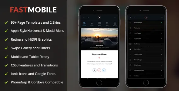
Fast Mobile
Created Dec 24, 2025