#1
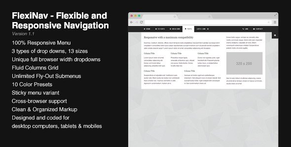
FlexiNav - Flexible and Responsive Navigation
This menu can be fixed at the top of the browser and has an optionnal trigger button to show or hide the menu bar. On mobile devices, the menu is put back into the flow of the page to make sure that all the content can be reached (fixed elements that don’t fit into a phone screen can’t be scrolled). If one menu isn’t enough, you can add others as you wish.