HTML5 Zoomer Plugin FWD
Description


Version 1.3 Release Date 07.09.2013
- Improved mobile performance.
- Fix bug that prevented links to work on mobile devices.
Version 1.2 Release Date 19.07.2013
- Fixed various bugs related to the latest version of jquery (v 1.10)
Version 1.1 Release Date 20.09.2012
- We have added a new feature which was a request, now when a marker is selected and a tooltip is opened it will stay opened until the mouse leaves the tooltip area.
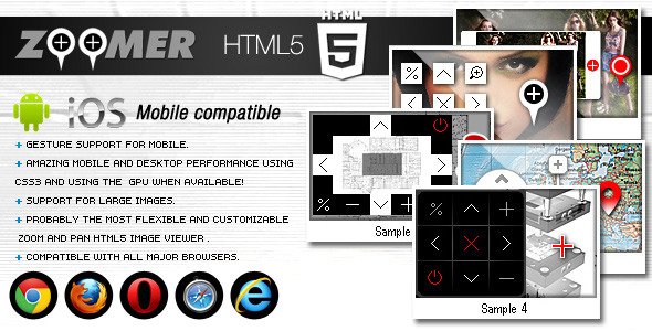
The HTML5 Zoomer Plugin FWD is a great image navigator and a panning tool for displaying large images. It is compatible with all major desktop and mobile browsers. It is a powerful image viewer prepared for showcasing products (high resolution product images, e.g. clothes, cars, technical schemes etc), displaying maps, and any other images, with its zooming, panning, dragging, navigation controls, scrollbar, zoom buttons,and highly customizable markers. It is very easy to configure and maintain it in XML and also, as a plus, you can open it in a lightbox window just like the jQuery plugin.
You can use any size for your content (image) and the loaded content will adapt based on the plugin size (width and height) specified in the configuration XML file. This feature makes it a perfect choice for any project that you have in mind.
This zoom & pan HTML5 plugin has an amazing performance on mobiles using CSS3 with gesture events support: the image is zoomed with two fingers working just like a native application. It was coded and optimized for mobile devices and it is 100% mobile compatible and of course it will run just as great on PC. We’ve tested it on IPAD3 and it runs great. Click here to see a video demo on IPAD3
This HTML5 zooming and panning plugin can be embedded in WordPress and you will receive, along with the download files, the complete instructions in the help file. WordPress demo available here.
Features:
Fully XML driven this makes it really easy to install and maintain. Support for really large iamge files we have tested it with 6000×6000px .jpg and it is working great.
Support for multiple instances in the same page, you may have as many Zoom Plugins as you want in the same page and each one of them with a different image and different settings.
RESIZABLE, You can specify your own canvas width and height.
The entire color theme, backgorund color and graphics (buttons, scrollbar, markers, mini map etc) can be modified and positioned anywhere with ease, this interactive parts are actually images (.png or .jpg) so you can replace them with your own graphics, the graphics can be any size or shape, basically the look of this component can be completely modified, please make sure to view all the samples in the live preview.
All the buttons can be enabled or disabled, including the scrollbar and mini map, Navigation / controls (up, down, left, right, zoom in, zoom out, reset, maximum size, on/off ) buttons can be enabled or disabled with ease.
Highly customizable image preloader, you can change the radius, thickness and color theme.
The initial zoom percentage and the zoom factor can be set, so you can zoom the image as much as you like just by changing a parameter in the XML file.
The speed of zooming and the speed of movement in response to the buttons, scroll bar or to the mouse wheel or to the gesture on mobile can be adjusted.
Scrollbar for zooming the image in and out (can be enabled or disabled).
On / Off button for controls, with this feature the visitor will be able to hide the navigation controls in order to see the image behind the controls and the On /Off button can be pressed again in order to make the controls visible again.
Small image navigator (mini map) is completely customizable, the navigator size position, border size, border color, border opacity, border radius can be set (can be enabled or disabled).
Markers and/or tool tips, unlimited number of markers is supported, the position of this markers is set with ease in the XML file, when a marker is pressed or touched the image will zoom to the point in which the marker is positioned and align the zoom point to center, on mobile when a marker is touched adn it is in its final position and zoom level the tool tip will appear if it is not disabled. The markers can be used without tool tips, the tool tips can be disabled individually for each marker.
Markers zooming factor percentage, this can be set individually for each marker, for example a 50% (zooming factor percentage) will be half of the initial zoom factor, this means that by setting a zooming factor percentage at 50% the image will be zoomed 50% (half) of the initial zoom factor and align the zoom point to center, basically you can add custom zoom levels for each marker, this is a really handy feature.
The tool tips are highly customizable, the size can be set, the content of this tool tips can be any HTML content , you can add anything you like in them (images, text, div, p , li …) and also you can style the content with CSS.
The Zoomer Plugin can be used inside a HTML page or be opened in a lightbox window just like the jquery plugin.
Five skins included, you can view them all in the live previews.
Many other cool features…
Categories
Tags
External listing. code.market does not sell this product and does not process payment for it. Pricing, payment, delivery, licensing, refunds, and support are handled by the third-party merchant on its own website. We may earn an affiliate commission from a referral. Details.
Products of the Week.
Submit#1

wanapi.app
Wan API is a developer platform for the Wan video model family. Compare Wan 3.0, Prime and Pro specifications and prices, then prepare a request in the preview playground.
Other · 8,120 views · 21 clicksOther · Week 42 · 8,120 views · 21 clicks
#2

wanapi.ai
Wan API is a developer platform for the Wan video model family. Compare Wan 3.0, Prime and Pro specifications and prices, then prepare a request in the preview playground.
Other · 7,469 views · 12 clicksOther · Week 42 · 7,469 views · 12 clicks
#3

yee.site
Your link in bio, but a real website. Start from beautiful templates and ready-made sections, then add a shop, bookings, a blog and as many pages as you need. Perfect for your link in bio, portfolio or personal site.
Other · 13,548 views · 22 clicksOther · Week 42 · 13,548 views · 22 clicks
#4

upvote.club
Free Social Media Engagement that Helps Boost Your Content. Upvote Club supports 19 social networks with 100+ engagement actions in one dashboard. Add links to your posts and get free engagement from real users.
SaaS · 34,445 views · 104 clicksSaaS · Week 42 · 34,445 views · 104 clicks
#5

Seenshot App
Free, Fast, MacOS Screenshot app. Make Screenshot cmd+shift+2 and send it via link
Desktop App · 22,937 views · 114 clicksDesktop App · Week 42 · 22,937 views · 114 clicks
#6

Conversational Backlinks for Busy Founders
Place Backlink Relevant Conversation for your domain across Forums and Conversations
Website · 34,711 views · 204 clicksWebsite · Week 42 · 34,711 views · 204 clicks
#7

Substack Posting API
Onboard your Agent to Substack. Write Publish on Substack via API
SaaS · 53,578 views · 190 clicksSaaS · Week 42 · 53,578 views · 190 clicks
#8

codester.com
SocialDesk+: Omnichannel Social Commerce & Business Management Platform This is stronger than simply “Social Commerce and Messaging” because it tells buyers this is a complete business platform, not just a messaging script. Turn Social Conversations Into Sales SocialDesk+ is a complete omnichannel social commerce and business management platform built for businesses that sell and communicate with customers through social media. Instead of switching between WhatsApp, Facebook, Instagram and TikTok, businesses can manage customer conversations, comments, products, leads, follow-ups, automation, teams and business reports from one professional workspace. And because the full source code is included, developers, agencies and entrepreneurs can customize, rebrand and launch SocialDesk+ as their own business solution or SaaS platform. 🚀 Build Your Own Social Commerce Business SocialDesk+ gives you the foundation to launch: - Your own SaaS platform - A white-label social CRM - A social-commerce management system - A customer communication platform - A business messaging solution - A custom solution for clients - A multi-business subscription platform 💬 Connect Your Customers Supported social channels include: WhatsApp • Facebook • Instagram • TikTok Bring supported conversations into one centralized workspace and help businesses respond faster without constantly switching between platforms. 🛍️ More Than a Messaging Platform SocialDesk+ combines communication with the tools businesses need to manage customer opportunities: Inbox Manage customer conversations from connected channels. Comments Monitor and respond to social-media comments. Customers & Leads Organize customer information and potential buyers. Products & Catalog Manage products and give your team quick access to product information. Follow-Ups Make sure potential customers don't get forgotten. Automation Automate repetitive customer questions and responses. AI Assistant Provide AI-assisted communication when configured. Team Management Give managers and staff access to the business workspace. Reports & Analytics Track activity using business reports and analytics. The current product listing already includes these capabilities. 🔥 Why Buyers Will Want It Launch Faster Start with an already-built business platform instead of developing the entire system from zero. Customize Everything The full source code is included, allowing developers to change branding, features, workflows and integrations. Build a SaaS Create multiple business workspaces and offer SocialDesk+ as a subscription-based service. Sell to Businesses Offer it to retailers, restaurants, service businesses, online sellers, agencies and other businesses that communicate with customers through social media. Mobile + Web + Backend This isn't just a mobile UI template. It includes: - Flutter mobile application - Python / FastAPI backend - Web interface - Administration tools - Database infrastructure - API-based architecture - SQLite / PostgreSQL support - Android and iOS project structure 💼 One Platform. Multiple Business Opportunities. For SaaS Entrepreneurs Launch your own subscription platform and allow multiple businesses to operate inside separate workspaces. For Software Agencies Customize and rebrand the platform for clients instead of building an omnichannel business system from scratch. For Developers Use the complete source code as a foundation for your own social-commerce or customer-management product. For Businesses Deploy a dedicated version for your own customer-service and social-commerce operations. 🧩 What's Included Mobile - Flutter / Dart - Android - iOS project Backend - Python - FastAPI - SQLAlchemy - Alembic Database - SQLite - PostgreSQL Web - HTML5 - CSS3 - JavaScript Deployment - Docker - Docker Compose - Production configuration Business Platform - Multi-workspace architecture - Authentication - Teams - Customers - Products - Messaging - Comments - Automation - Reports - Subscriptions - Administration The current listing also documents third-party integrations such as Meta, TikTok, Stripe, Firebase, SMTP and optional OpenAI configuration. ⚡ What Makes SocialDesk+ Different? You're not buying a simple: ❌ Chat UI ❌ WhatsApp clone ❌ Flutter template ❌ Admin dashboard ❌ Basic CRM You're getting a complete business platform foundation that can be customized, branded and commercialized. Connect. Automate. Manage. Grow. SocialDesk+ Omnichannel Social Commerce & Business Management Platform One important change I'd make to the current listing The current page starts with: “A simple guide to managing your social conversations, customers, products and business activity.”
Other · 20,949 views · 35 clicksOther · Week 42 · 20,949 views · 35 clicks
#9

sandbook.app
Sandbook reads EPUB, PDF, web pages and scanned pages aloud with Kokoro TTS, an open neural voice model that runs on your iPhone, free and offline. Choose from 41 natural voices in English, Spanish, French, Italian, Brazilian Portuguese and Hindi and follow each word as it is spoken. Try the same voices in your browser first with the free Kokoro TTS online demo.
Other · 20,857 views · 17 clicksOther · Week 42 · 20,857 views · 17 clicks