
ComponentX
Description
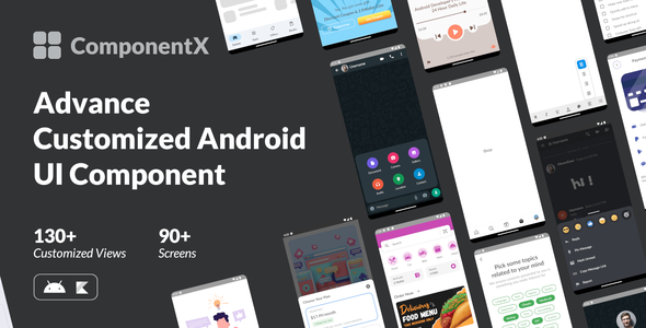
Exploring to customize Android UI in order to reach UI design requirement fit is much time consuming works. We have to try each view’s parameter and test it one by one.
So we do research to maximize customization possibility to get eye catching & functional User Interface.
In Collection section, we break the full screen design into a simplest part of it, a View. So that you can pinch it up and put into your own xml layout smoothly.
SCREENSHOTS


CUSTOMIZED COMPONENT
- Bottom Navigation
- Basic
- Icon
- Rise
- Badge
- Animated
- Play Store
- Button
- Collection
- Primary
- Primary Disable
- Primary & Secondary
- Secondary
- Tertiary
- Gradient
- Gradient & Secondary
- Primary Large
- Chips
- Collection
- Topic
- Color & Size
- Filter
- EditText
- Collection
- Limited Length & Suffix
- Clear Button & Required Length
- Stated & Hidden
- Email & Password
- No Background
- CheckBox
- Collection
- Single Line
- Policy
- Right
- Sole
- RadioButton
- Collection
- Single Line
- Background & Right
- Icon
- Sole
- Switch
- Collection
- Multiline
- Icon
- Sole
- Seekbar & Slider
- Collection
- Continuous
- Range
- Discrete & No Thumb
- Labeled
- No Thumb
- TextView
- Collection
- See More (Bold)
- Todo (Strikethrough)
- Privacy Policy (Bold & Clickable)
- Discount Price (Strikethrough, Color, & Size)
- Register (Bold, Italic, & Color)
- Dialog
- Collection
- Delete
- Success
- Progress
- Popup Window & Popup Menu
- Collection
- Attachment Info
- Doc Editor
- Whatsapp Attachment
- Dropdown
- Collection
- Attendance
- Country
- Phone Code
- AutoCompleteTextView
- Collection
- Attendance
- Country
- Phone Code
- Bottom Sheet
- Collection
- Modal – Menu
- Modal – Option
- Modal – Discord
- Persistent – Play
- Persistent – Whatsapp
WHAT YOU GET
- Full Android Source Code
- Project Documentation
TRY THE USER EXPERIENCE

CHANGE LOG
# Version 2.2 – 14 Aug 23
- UPDATE
- Update Spannable TextView to TextView
- Dependencies updates
- Update minSdk to 33
- Update targetSdk to 17
- Gradle update
- Chip Size
- Chip Topic
– NEW SCREEN
- Filter Chip
- No background EditText
- See More Textview
– NEW COMPONENT
- See more Textview
# Version 2.1 – 22 Nov 22
- Significant UI Component Update
# Version 1.1 – 9 Aug 22
- Initial Release
| Type | Android App |
|---|---|
| Author | SoftComfy |
| Price | $25 |
| Sales | 6 |
| Rating | 0 (0) |
| Published | Feb 27, 2023 |
| Last Update | Aug 20, 2023 |
| Compatible Software | Kotlin 1.x, Android 12.0, Android 11.0, Android 10.0, Android 9.0, Other |
| Demo Url | https://play.google.com/store/apps/details?id=comfysoft.componentx |
| Mobile Files Included | .apk, .java, .xml |
Categories
Tags
External listing. code.market does not sell this product and does not process payment for it. Pricing, payment, delivery, licensing, refunds, and support are handled by the third-party merchant on its own website. We may earn an affiliate commission from a referral. Details.
Products of the Week.
Submit🥇

STOP GUESSING WHAT TO POST
AI that learns your brand voice and builds a month of consistent, on-brand social content: carousels, posts and hooks that sound like you, not like everyone else's AI.
SaaS · 7,329 views · 67 clicksSaaS · Week 46 · 7,329 views · 67 clicks
🥈

Conversational Backlinks for Busy Founders
Place Backlink Relevant Conversation for your domain across Forums and Conversations
Website · 46,597 views · 232 clicksWebsite · Week 46 · 46,597 views · 232 clicks
🥉

upvote.club
Free Social Media Engagement that Helps Boost Your Content. Upvote Club supports 19 social networks with 100+ engagement actions in one dashboard. Add links to your posts and get free engagement from real users.
SaaS · 44,539 views · 127 clicksSaaS · Week 46 · 44,539 views · 127 clicks
#4

Substack Posting API
Onboard your Agent to Substack. Write Publish on Substack via API
SaaS · 63,425 views · 206 clicksSaaS · Week 46 · 63,425 views · 206 clicks
#5

Seenshot App
Free, Fast, MacOS Screenshot app. Make Screenshot cmd+shift+2 and send it via link
Desktop App · 32,671 views · 127 clicksDesktop App · Week 46 · 32,671 views · 127 clicks
#6

Hand-Placed Backlinks $9.99 per link. Flat rate.
Buy hand-placed forum, Q-A and directory backlinks. Flat $9.99 per link, no subscriptions — you only pay for approved listings.
Website · 8,298 views · 19 clicksWebsite · Week 46 · 8,298 views · 19 clicks
#7
Free Invoice Generator - PDF Invoices in Your Browser, No Sign-Up
A free invoice maker for freelancers and small businesses: fill in the invoice, check the live preview, and download a PDF that looks exactly like it. Any currency, tax per item, three templates, no sign-up, and nothing leaves your device.
6,925 views · 29 clicksWeek 46 · 6,925 views · 29 clicks
#8

Merge PDF Files Free - Combine PDFs in Your Browser, No Upload
A free PDF merger for office workers, students, and freelancers: combine PDFs and images into one file in the browser, reorder files and pages, pick page ranges, keep bookmarks, and open password-protected PDFs. Nothing is uploaded, no sign-up, no watermark.
6,408 views · 18 clicksWeek 46 · 6,408 views · 18 clicks