The Largest Curatorial Library
With Responsive Tablet

Maxsmart | Multipurpose Responsive HTML for Mobile and Tablet

Maxsmart | Multipurpose Responsive HTML for Mobile and Tablet

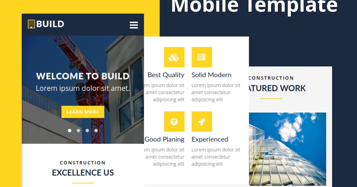
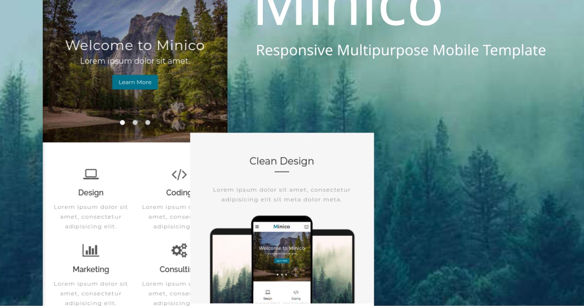
Best, creative and cheerful feature loaded with Material UI. Max Smart is multipurpose mobile and tablet responsive HTML template. You can use it as website or you can built into phone gap app. You can directly use feature and create hybrid mobile application. Our goal is to provide customer centric product with look and feel and easy to use functionalities.

Created Aug 21, 2016 · Updated Dec 30, 2025 · ★ 4.89 (9) · 351 sales

Mobilize - jQuery Mobile WordPress Theme

Mobilize - jQuery Mobile WordPress Theme

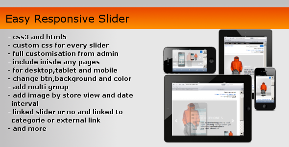
Mobilize is a touch optimized mobile WordPress theme built on jQuery Mobile and is loaded with features. The homepage has a touch optimized responsive slider with 24 transitions (swipe with your finger!), optional captions, social icons and more. The interior features a touch optimized gallery, contact form, blog with featured images and featured videos, tons of shortcodes and more. Four color schemes are included, and customizing colors is a breeze with the built in theme options manager. The extensive theme options manager allows you to choose from over 150 Google fonts, choose social icons, set blog options and more! Check out the searchable lists, including thumbnail lists and events lists!

Created Nov 1, 2012 · Updated Jan 11, 2023 · ★ 4.03 (74) · 876 sales

Circuit - Electronic Store Prestashop 1.7 & 8.x Responsive Theme

Circuit - Electronic Store Prestashop 1.7 & 8.x Responsive Theme

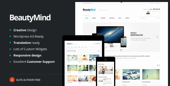
Circuit – Electronic Store Prestashop 1.7 theme made with special attention given to stores selling digital goods online like electronic goods, drone, speakers, DJ set, digital watch , wrist belt, computers , laptop , mobiles , tablet , key board , mouse , chargers , projectors , pen drive , music devices , security devices , health devices & multipurpose store.

Created Feb 5, 2020 · Updated Oct 5, 2026 · ★ 4.75 (4) · 22 sales

4eeder - A Responsive Web UI Kit

4eeder - A Responsive Web UI Kit

4eeder is a professional responsive NEWS PORTAL web UI kit, extending to Media Center, Press Center, Blog, Magazine etc, ready-made for creating cross-platform website includes desktop, tablet and mobile templates. 4eeder contains 36 pre-build responsive web pages including home page and article page with 6 different styles and with more than 200 base elements and components in 21 categories . Each templates is fully customizable, easy to use and carefully assembled in .SKETCH file types.

Created Apr 25, 2016 · 29 sales