The Largest Curatorial Library
With Responsive Design

4eeder - A Responsive Web UI Kit

4eeder - A Responsive Web UI Kit

4eeder is a professional responsive NEWS PORTAL web UI kit, extending to Media Center, Press Center, Blog, Magazine etc, ready-made for creating cross-platform website includes desktop, tablet and mobile templates. 4eeder contains 36 pre-build responsive web pages including home page and article page with 6 different styles and with more than 200 base elements and components in 21 categories . Each templates is fully customizable, easy to use and carefully assembled in .SKETCH file types.

Created Apr 25, 2016 · 29 sales

Lemux Network Mobile UX UI News and Magazine HTML Template

Lemux Network Mobile UX UI News and Magazine HTML Template

Lemux Multipurpose Mobile UX UI HTML Template, Lemux is HTML, CSS and js templates. We have covered major HTML elements. Also customized widget elements with this. We’ll also expand it and always HTML 5 and major use of CSS3 we targeted. The framework we have used are bootstrap 4.4.1 version and Framework 7 v5.1.0. So its uses flex-box properties and gives much smooth responsive utilities. The framework itself comes with responsive adjust into major devices small to large. Bootstrap templates and Framework 7 designs also have wide range of Mobile HTML Template. As the latest technology and framework targeted it comes with Major all latest versions of browser Chrome, Safari, Firefox, IE 10+, Edge and opera. We also consider devices layout will be responsive which gives new touch.

Created Dec 2, 2019 · Updated Jun 4, 2020 · ★ 0.00 (1) · 82 sales

Flotter - Responsive Creative HTML5 Template

Flotter - Responsive Creative HTML5 Template

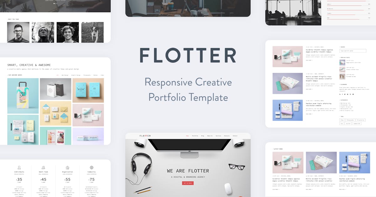
Flotter is a responsive site template with unique, minimalist and ajax-powered portfolio which is suitable for artists, photographers, creative agencies, digital studios, personal freelancers, and any kind of business owners that would like to showcase their portfolio beautifully. Since the template is responsive, the layout will adapt to different screen sizes which will make your website compatible with any device such as smart phones, tablets and desktop computers.

Created Dec 25, 2025