The Largest Curatorial Library
With Portfolio Iphone

Smart7 - Multi-Purpose Responsive Theme

Smart7 - Multi-Purpose Responsive Theme

Gutenberg Optimized: No, High Resolution: Yes, Widget Ready: Yes, Compatible Browsers: IE8, IE9, IE10, IE11, Firefox, Safari, Opera, Chrome, Compatible With: WPML, Software Version: WordPress 4.1, WordPress 4.0, WordPress 3.9, WordPress 3.8, WordPress 3.7, WordPress 3.6, WordPress 3.5, WordPress 3.4, WordPress 3.3, WordPress 3.2, WordPress 3.1, WordPress 3.0, Columns: 4+

Created Nov 11, 2013 · Updated Nov 27, 2018 · ★ 4.39 (31) · 346 sales

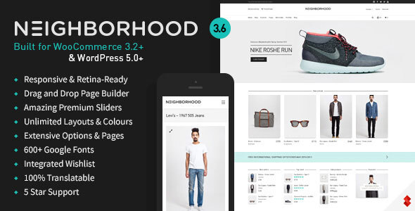
Neighborhood - Responsive Multi-Purpose Shop Theme

Neighborhood - Responsive Multi-Purpose Shop Theme

Neighborhood is super responsive, retina ready, and built upon the 1170px Twitter Bootstrap framework. Featuring a clean, modern, and superbly slick design, packed with the most powerful Swift Framework which offers limitless possibilities. The incredible Swift Page Builder is at the core of our framework, giving you the control to create sites that do your content justice. We’ve built in some incredible features such as the super search, full WooCommerce support, and so much more. If you’re looking to build any kind of website, then Neighborhood is what you need.

Created Dec 24, 2025

Flexform - Retina Responsive Multi-Purpose Theme

Flexform - Retina Responsive Multi-Purpose Theme

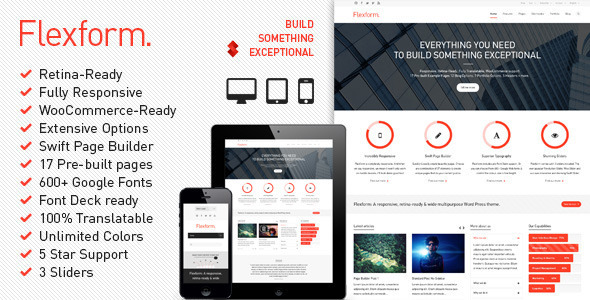
Flexform is the ultimate multi-purpose WordPress theme. It’s super responsive, retina ready, and built upon the 1170px Twitter Bootstrap framework (v2.2.2). Featuring a clean, modern, and superbly slick design, packed with the most powerful Swift Framework which offers limitless possibilities. The incredible Swift Page Builder is at the core of our framework, giving you the control to create sites that do your content justice. With so many features, tools, variations and options to offer, it’s the last corporate theme we think you’ll ever need.

Created Dec 23, 2025

Flicknclick - Responsive Mobile/Smartphone Theme

Flicknclick - Responsive Mobile/Smartphone Theme

Flicknclick – Responsive Mobile/Smartphone Theme adapts to your customer’s chosen device, whether it is a smartphone (iPhone, Android) or tablet (iPad). The responsive layout adjusts to the changing mobile trends. The professional and crisp design provides a clean and simple user experience.. Flicknclick has a responsive, mobile first grid system that adapts your website to mobile devices and the desktop or any other viewing environment. Theme features One page layout template, 2 Widget Areas, Blog layouts and more. Powerful but simple Theme Options for full CMS control with easy Logo Upload and Social Networking etc. Flicknclick is WooCommerce Compatible, Multilingual Ready (WPML), Retina-Ready, Search Engine Friendly and W3C Markup Validated. Cross-Browser compatible. If you want to dominate mobile world with mobile-friendly content, then FlicknClick is the way to go. This template material design, modern design, clean design, clean code and easy to customize, easy to cange color and many more. Features Creative Design Easy to Customize Clean Design Clean Code Many Pages Font Awesome Material Design Store Blog Team and others

Created Feb 11, 2017 · Updated Jan 26, 2026 · ★ 0.00 (1) · 84 sales