The Largest Curatorial Library
With Mobile Design

Maxsmart | Multipurpose Responsive HTML for Mobile and Tablet

Maxsmart | Multipurpose Responsive HTML for Mobile and Tablet

Best, creative and cheerful feature loaded with Material UI. Max Smart is multipurpose mobile and tablet responsive HTML template. You can use it as website or you can built into phone gap app. You can directly use feature and create hybrid mobile application. Our goal is to provide customer centric product with look and feel and easy to use functionalities.

Created Aug 21, 2016 · Updated Dec 30, 2025 · ★ 4.89 (9) · 351 sales

4eeder - A Responsive Web UI Kit

4eeder - A Responsive Web UI Kit

4eeder is a professional responsive NEWS PORTAL web UI kit, extending to Media Center, Press Center, Blog, Magazine etc, ready-made for creating cross-platform website includes desktop, tablet and mobile templates. 4eeder contains 36 pre-build responsive web pages including home page and article page with 6 different styles and with more than 200 base elements and components in 21 categories . Each templates is fully customizable, easy to use and carefully assembled in .SKETCH file types.

Created Apr 25, 2016 · 29 sales

FASTAPPS Creative Mobile Apps PSD Template

FASTAPPS Creative Mobile Apps PSD Template

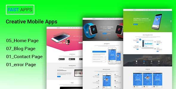
FASTAPPS Creative Mobile Apps PSD Template is designed with a clean look and feel, the stylish & modern trend that totally flexible to bring high aesthetic & conversion for an App promotion & would be suitable not only for a mobile app but also for mobile games showcase or any application website showcase. It comes with one unique layout which includes tons of sections, customization options and features for multiple purposes.

Created Dec 24, 2025