#1

Blue Bird - Html5 Mobile Game - android & ios (Construct 2)
#1
Blue Bird - Html5 Mobile Game - android & ios (Construct 2)
#2
Reload - Responsive Multi-Purpose WordPress Theme
Full support of WooCommerce Shop Plugin, bundled with Revolution Slider and 12 predefined skins. These new features, in combination with WPBakery Page Builder, Redux Framework, WPML support (certificate of compatibility) and so much more, make Reload the most value for money theme on Themeforest. Click below and try it now for just $49!
#3

Corpus - Responsive Corporate WordPress Theme
We bring Corpus, the first lightweight theme under so many incredible features. Corpus is the most suitable multi-purpose theme for building every website project you have in mind. The main concept behind Corpus is a user friendly environment that allows users to enjoy the clean and impressive design.
#4
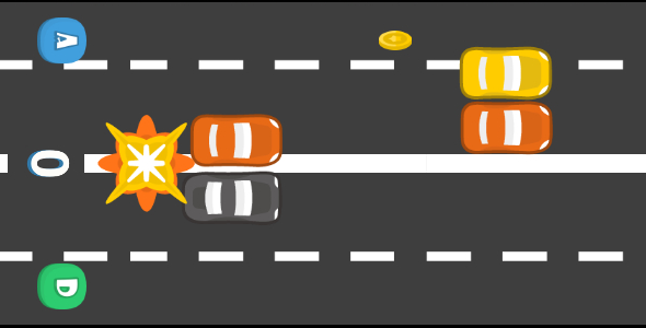
Blue Car - Html5 Mobile Game - android & ios
#5
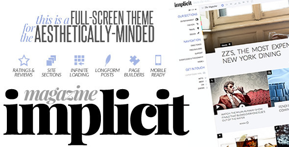
Implicit - Full-Screen Blazing-Fast Magazine Theme
The images used in the live preview were purchased for use in the demo and are not included in the download file. In addition, the demo XML file does not contain them but rather placeholders so that you can replace them with images that you own the rights to use. If you have any questions, please let us know via the support center.
#6
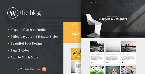
TheBlog - Multi Concept Blog & Portfolio
THE BLOG is a multi concept theme for Blog and Portfolio. Whether you are blog owners, freelancers, photographers or you are working on client project, this theme will help you get your work done easy and fast. Underneath the elegant look are many powerful features. Please take a look at our LIVE PREVIEW DEMO for more details. Please don’t forget to rate if you like the theme and leave comments so we can make better products.
#7
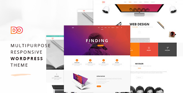
Do - Multipurpose Responsive WordPress Theme
DO is a Multipurpose WordPress Theme. This is a clean, stunning, fully responsive and modern Theme. WordPress Live Theme Customizer API gives you the full ability to create everything within a short time. There are different types of page variations. Visual Composer (Save $34) will help you to Design your Pages via Drag and Drop. It’s very simple and loved by many Website Owner. Slider Revolution (Save $19) helps you to create and Design your Website Slider easily.
#8
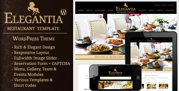
Elegantia - Restaurant and Cafe WordPress Theme
Elegantia is a premium WordPress theme for Restaurants & Cafes. It has many features that are required in a restaurant business. For example. Reservation, Food Menus, Events, Gallery, Team Members, Contact, Impressive Homepage with fullwidth slider and services information.
#9

Monster Copter - Html5 Mobile Game android & ios
#10
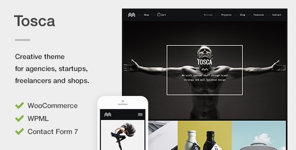
Tosca - A Fresh Creative Portfolio & Ecommerce WordPress Theme
The theme is equipped with an exquisite parallax animation on the heading sections, which can be configured on images, videos or sliders and offers a unique, interesting effect to impress your audience. It also offers a modular page template, which comes with a beautiful custom module builder that allows you to create your own layouts in seconds. Compose with any background color, text, images, sliders, videos, maps, audio tracks and project galleries with ease and no coding knowledge required.
#11

CSS3 Fullscreen Loading Animation Effects
#12
Full-screen Video, YouTube & Image Background by Dear
#13
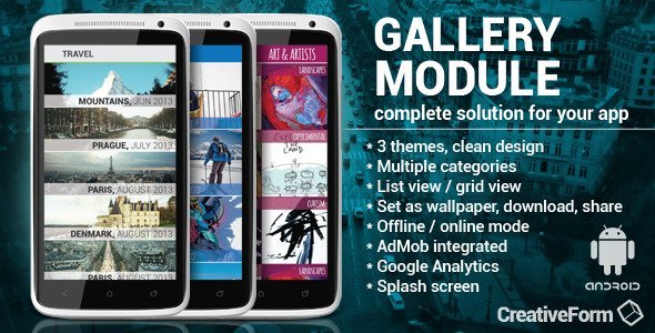
Gallery module with AdMob/Analytics
This Android Gallery module is created to save time for integration of gallery feature of your application. All you have to do is to start Android activity and pass some data. In the ZIP file that you purchase you have a sample application, with all data and instructions provided.
#14
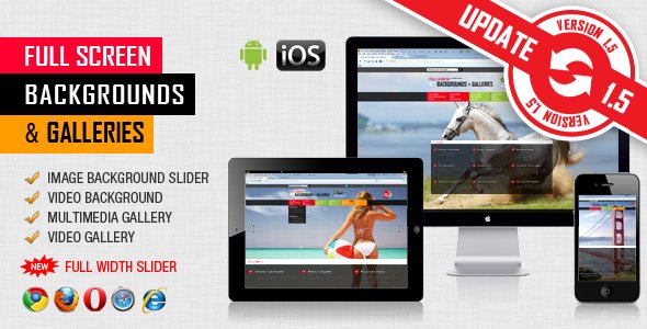
FullScreen Background / Gallery - Image and Video
This jQuery plugin can be used as Full Screen Multimedia Background, Full Screen Multimedia Gallery and Full Width Multimedia Slider with both Images and Videos
#15
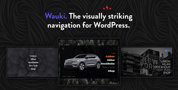
Wauki
Whether you’re looking to spice up your own personal or business website or you’re a developer looking for a time- and money-saving way to impress your client with a visually striking navigation, the Wauki plugin is the tool for the job.
#16

Creative Mind - Creative One Page PSD Template
CREATIVE MIND is a Creative Multipurpose One Page Portfolio PSD Template with fully responsive and Mobile layout. A page size is 1600 Pixels by 8808 Pixels at 1170 Grid System. Must be compatible with Adobe Photoshop CS6. It will perfectly suit the needs of any photographer, designer, illustrator, freelancer, portfolio, design agency, creative studios and professional business. Clean, minimalist and bold design will push your work. The template consists of well-organized components that are easy to use. It looks perfect on all major browsers, tablets and phones. Just take the best template of your choice, change the text, add your images and done!
#17
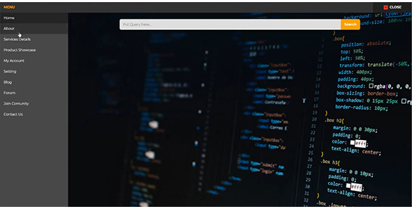
Full Screen Modal Nav Using Pure HTML and CSS
Basically, there is a button you will see at first. When you will click on it a box will appear with full-screen size, the box contains the nav. The nav has a sidebar a top bar, a blank field with a search box. In the sidebar, there are nav items or links and each item has its own image, when you click on any item the image will change on the left blank field. At the top bar, there is a text for showing the menu and a close button to close the popup box. This program is also responsive, in small screen size the sidebar will shift to the top and you have to scroll to see all items.
#18
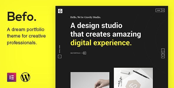
Befo - A Portfolio Theme for Creative People
Befo is a minimal, creative and elegantly designed WordPress Theme oriented to Creative Professionals, Designers, Freelancers and Digital Agencies that will surely impress potential clients and will create a strong first impression.
#19
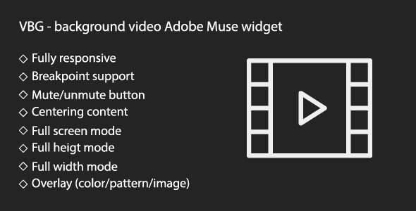
VBG - responsive background video widget
#20
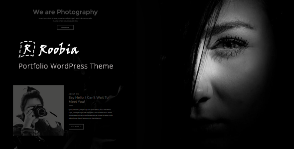
Roobia - Portfolio WordPress Theme
Roobia is a beautiful WordPress theme created for creative Photographers and Portfolio Websites. It focuses on big portfolio images, minimal design, and beautiful typography so that your content stands out first.