The Largest Curatorial Library
With Blog Minimalistic

Nostalgia - Responsive Portfolio WordPress Theme

Nostalgia - Responsive Portfolio WordPress Theme

The Theme contains typical descriptive pages like about and services, portfolio page with categories based on accordion, build-in lightbox and possibility to play youtube and Vimeo videos, main blog page and single post page with categories, comments and lightbox build-in, contact page with map of location and with working contact form.

Created Jun 1, 2012 · Updated Sep 17, 2026 · ★ 4.33 (235) · 1.7K sales

Ubergrid - Responsive Grid WordPress Theme

Ubergrid - Responsive Grid WordPress Theme

Ubergrid is a grid-based, responsive, retina ready, post-format supporting, minimalistic WordPress theme suitable for any kind of creative, personal or business use. It comes with a Theme Manager, Page builder, Front Page Manager, Infinite Scroll and many other options. Importing the demo content with one click gets you going with Ubergrid in no time! Enjoy!

Created Dec 12, 2013 · Updated May 30, 2019 · ★ 4.77 (106) · 1.9K sales

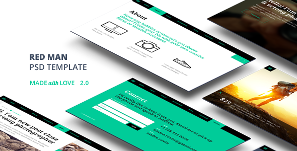
Redman One Page PSD Template

Redman One Page PSD Template

2.0 Redman will push your work! One page. A page size is 1220 pixels by 5600 pixels at 72 PPI. Mobile page size 320 pixel by 4600 pixels at 72 PPI. Must be compatible with Adobe Photoshop CS5. Redman. One page PSD template for personnal portfolio or vCard. It will perfectly suit the needs of any photographer, designer, illustrator. Clean, minimalistic and bold design will push your work. The template consists of well-organized components that are easy to modify. PSD Template Features

Created Dec 24, 2025

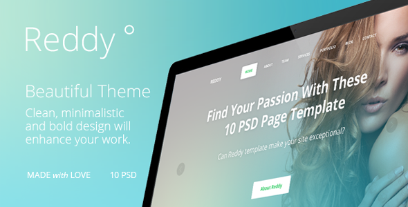
Reddy PSD template

Reddy PSD template

Reddy Reddy is a multipurpose PSD template suitable for companies or individuals. Reddy is a responsive design, suitable for Bootstrap 3.0. It is a great way to present your work at the highest level. Clean, minimalistic and bold design will enhance your work. The template consists of well-organized components that are easy to modify. A page size is 1440 pixels by 6100 pixels at 72 PPI. Mobile page size 320 pixel by 5400 pixels at 72 PPI. Must be compatible with Adobe Photoshop CS5

Created Dec 24, 2025

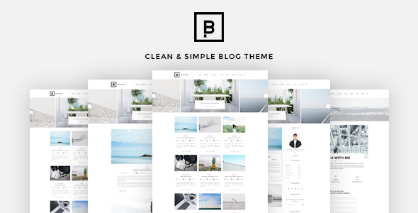
BasicMag - Minimalist Responsive Personal Blog

BasicMag - Minimalist Responsive Personal Blog

Our 2016 default theme is clean, blog-focused, and designed for clarity. BasicMag’s simple, straightforward typography is readable on a wide variety of screen sizes, and suitable for multiple languages. We designed it using a mobile-first approach, meaning your content takes center-stage, regardless of whether your visitors arrive by smartphone, tablet, laptop, or desktop computer. Our purpose was to create minimal and elegant theme with nice to eye layout. It is perfect for your blog!

Created Dec 23, 2025