#1
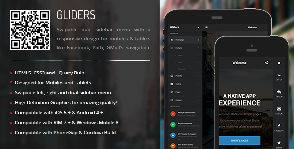
Gliders | Sidebar Menu for Mobiles & Tablets
#1
Gliders | Sidebar Menu for Mobiles & Tablets
#2
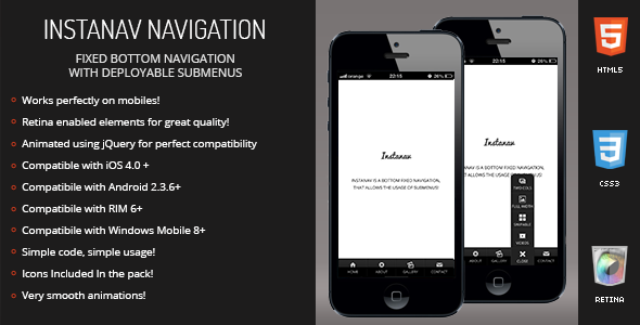
Instanav | Bottom Navigation for Mobiles & Tablets
#3
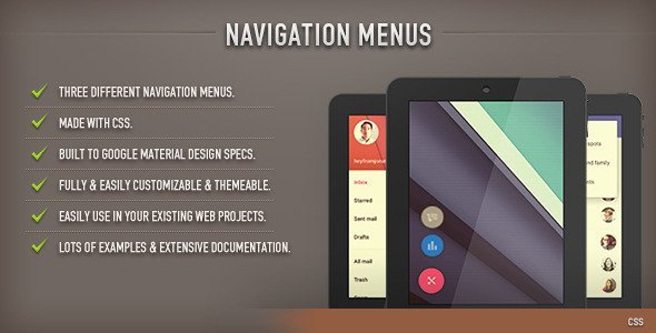
Navigation Menus (CSS)
#4
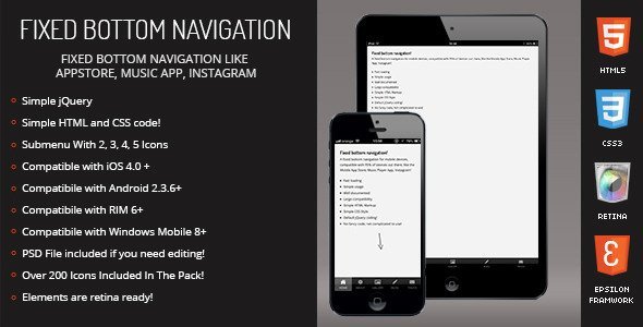
Resepina | Fixed Bottom Menu for Mobiles & Tablets
#5

Sitebar | Sidebar Menu for Mobiles & Tablets
#6
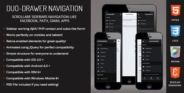
DuoDrawer | Sidebar Navigation for Mobile & Tablet
#7
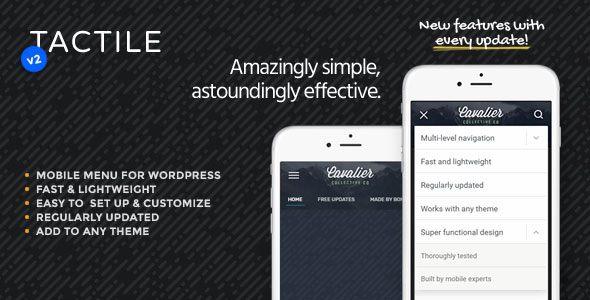
Tactile
Tactile is a menu and header solution that makes browsing WordPress websites on the smaller screen of a smartphone feel natural and effortless. Tactile’s design in its entirety is clean and most importantly extremely comfortable to interact with even on the smallest of screens while its numerous settings and customization options make it suitable for any type of site.
#8

Drawer | Sidebar Navigation for Mobiles & Tablets
#9

Morph
While designed primarily as a mobile menu, Morph works wonderfully on both desktop and touch devices and can be set to be shown at specified resolutions only, meaning – if you so wish – it can easily be used as a mobile-only or desktop-only menu.
#10

TapTap
With TapTap, we set out to create an easy-to-customize, mobile-first, off-canvas menu plugin for WordPress that would be versatile enough to be used on literally any site.
#11

EXPO Scaling Menu with React Navigation