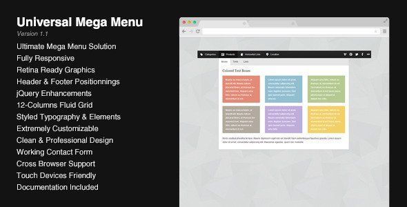
Universal Responsive Mega Menu
Description


This menu is the result of a combination of my best works on Codecanyon : I’ve put together a flexible mega menu system that can hold 12 sizes of drop downs, unlimited fly-out elements combined with a jQuery script to enhance the whole system.
It can be used as a sticky footer (with mega “drop-ups”) using the exact same markup as the “standard” mega menu. You can switch between those 2 variants just by changing a single class.
By using the example pages, you have all the necessary code ready to be used in your site. Customizing the menu require some basic knowledge of CSS and you can change the look of every part of the menu : the fonts, the colors, the sizes, etc. The script includes a few options easy to set up so you can choose which type of effect to apply (on mouse hover or mouse click, fade, slide…).
Features
- Header and Footer Mega Menus
- Fully Responsive Menu
- Retina Ready Graphics
- Flexible 12-Columns Grid
- Styled Typography and Elements
- Simple Working Contact Form
- Clean and Professional Design
- Touch-Screen Devices Friendly
- Cross-Browser Support
Usages
- Standard Top Menu
- Sticky (or fixed) Top Menu
- Sticky Footer
- Multiple Menus on a same page
- Collapsible Menus
- Responsive or Non-Responsive
What you get
The package contains 2 folders : “Responsive” and “Non-Responsive” so the menu is ready to be included on any type of website. In each folder, all the code is organized, indented and easy to read. The script comes with an uncompressed version and a minified version. Additionnally, all graphics are optimized for retina displays.
For each version of the menu, responsive and non-responsive, you have 6 HTML files with various examples of what you can do with the menu, from a simple navigation bar without drop downs to a combination of 2 mega menus on a same page.
There’s also a simple contact form included (check the live preview to see it in action), it’s ready to be used and requires only your email address to be functionnal.
Compatibility
This menu has been tested on many devices and browsers to ensure a maximum compatibility : Internet Explorer, Firefox, Chrome, Opera, Safari have successfully passed the tests. Here’s a list of compatibility :
- Internet Explorer 7+
- Firefox 2+
- Chrome
- Opera
- Safari 3+
- Chrome on Android
- Safari on iPad and iPhone
The whole menu relies mainly on CSS, it means that if Javascript is disabled, most of the menu will work. You also may notice some differences between browsers : some CSS3 effects like shadows or rounded corners are not showing up in Internet Explorer for example (for more informations on this topic, you can visit findmebyIP). Be sure to test the demo with different browsers or devices to make sure that the menu meets your requirements.
Changelog
01/18/2014 – Version 1.1
- Improved the script files
11/11/2013 – Version 1.06
- Improved the switching between desktop and mobile versions
09/29/2013 – Version 1.05
- Fixed a visual issue
09/21/2013 – Version 1.04
- Improved behavior on iPad
08/14/2013 – Version 1.03
- Fixed a small bug related to the contact form in mgmenu_plugins.js
07/19/2013 – Version 1.02
- Fixed an issue with the contact form in the script (mgmenu_plugins.js)
07/10/2013 – Version 1.01
- Fixed an issue occurring on orientation change
06/16/2013 – Version 1.0
- Initial Release
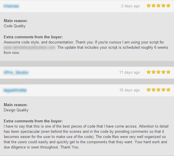
Feedbacks
Here are a few recent reviews from customers, names have been blurred to preserve their privacy.
- 6 month free support included from author
- Free lifetime product updates guarantee
- 360 degrees quality control