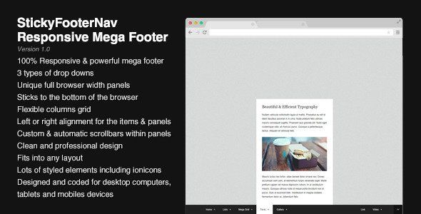
StickyFooterNav - Responsive Mega Footer
Description


StickyFooterNav is a unique mega footer solution designed and coded to work and fit on any device. It is fully responsive and comes with a flexible grid system to hold your content within panels.
By setting a few options, you can make the footer work on hover or on click, define effects durations, enable or disable responsiveness or a trigger button to toggle the footer bar.
This footer stays fixed at the bottom of the browser and adapts itself on mobile devices to make sure that all the content can be reached on any device : all the elements are properly resized and the panels will show scrollbars when the content won’t fit into the available space on the screen. You can check that by testing the live preview on tablet and mobile devices (preferably without the top frame).
StickyFooterNav comes with a full set of panel sizes from fixed widths (12 sizes) to panels that can cover either the whole browser width or the menu width. Each panel can independently stick to the left edge or to the right edge of its parent. In the same way, the footer bar can contain left aligned or right aligned items. All elements are resized down when viewed on a mobile device with a single break point. It means that you can use your own break point just by changing 2 values (described in the documentation).
If you have a lot of content to add into a given panel, the custom scrollbars will show up automatically, you can see them in action by testing this demo and resizing up & down your browser.
StickyFooterNav includes a lot of styled elements such as headings, lists, lists with icons, form elements, etc. The ionicons icon collection is already there to enhance your list elements either in the footer bar or within the panels. The CSS file is well structured and easy to customize, all color settings are grouped in a separate section. Images and videos will automatically take the available space so you don’t need to resize them manually.
Features
- 100% Responsive & powerful mega footer system
- 3 types of drop downs (fixed width, mega and full browser width)
- Unique full browser width panels
- Sticks to the bottom of the browser
- Flexible columns grid
- Left or right alignment for the menu items and the drop downs
- Custom & automatic scrollbars within panels
- Clean and professional design
- Fits into any layout
- Lots of styled elements
- ionicons icon collection
- Designed for desktop computers, tablets and mobiles
Compatibility
StickyFooterNav has been tested on several devices and browsers to ensure a maximum compatibility : Internet Explorer, Firefox, Chrome, Opera, Safari have successfully passed the tests. Here’s a list of compatibility :
- Internet Explorer 8+
- Firefox
- Chrome
- Opera 10.50+
- Safari 5+
- Chrome on Android
- Safari on iPad and iPhone
Please keep in mind that CSS3 effects are not available for all browsers (older versions of IE for example).
Changelog
11/1/2014 – Version 1.0
- Initial Release
- 6 month free support included from author
- Free lifetime product updates guarantee
- 360 degrees quality control