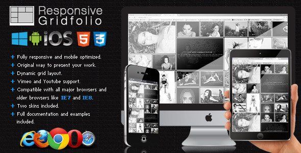
Responsive Gridfolio
Description


BUY ALL OUR PRODUCTS IN A MEGA BUNDLE WITH A 90% DISCOUNT!!! THIS IS A LIMITED OFFER SO HURRY UP AND GRAB IT!!! : https://codecanyon.net/item/fwd-mega-bundle/19117054
We released a better and more complete version at the following link:
Version 1.2 Release Date 27.09.2013
- Fixed bugs related to IE8.
- Fixed bugs related to the latest update of IOS and Android.
- Improved mobile performance.
Version 1.1 Release Date 24.07.2013
- Support for multiple categories, of course it can still be used with a single category as before.
- Lightbox Iframe support.
- Lightbox description autoopen (open item description without pressing the info button).
- Added an extra way to close the lightbox by pressing outside the item area.
- Added support for MSPointer events for windows8 mobile.
- Added six extra skins.
Main features:
The Responsive Gridfolio has a fluid / flexible / responsive layout. Basically the grid is added into a html page into a div of your chosing and it’s adapting based of that div’s width, the grid height is modified based on the thumbnails and if other elements are below the grid div they will be pushed down automatically (document flow). In the examples provided you can see a few ways in which you might use this grid, of course that other configurations are possible (please note that the code of this examples is provided in the download files).
The gallery can have any number of images and each image can be of any size, but proportional to a base thumb width and height. When a thumbnail is pressed you can choose either to display an original media lightbox which we have coded, or to open a new webpage, the url and target of this webpage can be specified. The lightbox can display images, or can display videos loaded from YouTube or Vimeo.
Pure OOP JavaScript code, no usage of jQuery or other libraries, in this way there will be no incompatibilities with HTML pages that might be using jQuery or other JavaScript libraries.
The Responsive Gridfolio is using the GPU (hardware acceleration) using HTML5 standards. The rendering speed and performance is impeccable on desktop computers and most importantly on mobile devices, the way it works it will try to use CSS3 and if this is not available it will down fall to CSS2 or CSS1 for older browsers like IE7 and IE8.
Great performance on mobile devices, you can see in the video demo that it runs just like a native app!, it was coded and optimized for mobile devices and it is 100% mobile compatible and of course it will run just as great on desktop computers including on older browsers like IE7 and IE8. We have tested it on IPAD3(ios) and on a SAMSUNG GALAXY S3(android) and it runs great on both devices, below are the links to view this demos. Watch demo running on Samsung Galaxy S3 (android) or Watch demo running on IPAD (IOS).
Grid main features:
Responsive / Flexible / Fluid layout: you can control the size of the grid with CSS or JavaScript, basically it has an adaptable layout which makes it the perfect candidate for any type of project.
Support for any number of images and each image can be of any size, but proportional to a base thumb width and height
The entire color theme can be modified.
Customizable thumbnails size and geometry: this feature allows you to change the size of the thumbnails and the space between thumbnails.
Customizable thumbnails border and background: each thumbnail can have a border and a background, the thumbnail?s background color, the border?s size and the border?s color are customizable, also the thumbnails border color can be tweened from a normal color to a selected color..
Thumbnail?s description or thumbnails media icons: each thumb can have a short description with a transparent background under it or a media icon which represents a link, video or image, this are visible when the mouse is over a thumbnail, the text can be formatted with CSS, the background color and opacity also can be modified (optional).
“Load more thumbnails feature”: this is an awesome feature which improves the overall performance and speed of loading because in this way not all the thumbnails are loaded and displayed at once. For example if you have a total of 120 thumbnails you can show them in sets of 50 thumbnails, and so initially in the grid the first set of 50 thumbnails are loaded and displayed, and when the “load more thumbnails” button is pressed the next set of 50 thumbnails are loaded and displayed, and finally when the “load more thumbnails” button is pressed again the 20 remaining thumbnails are showed. The number of thumbnails to load per set is customizable, it does not have to be 50 it can be any number that you consider. This feature is optional, if it is disabled all thumbnails are loaded and displayed.
Custom press thumbnail action: when a thumbnail is pressed you can choose either to display an original media lightbox which we have coded, or to open a new webpage, the url and target of this webpage can be specified. The lightbox can display images, or can display videos loaded from YouTube or Vimeo.
Lightbox main features:
Responsive / Flexible / Fluid layout: the lighbox will always fill the available browser viewport.
The entire color theme can be modified.
Vimeo and YouTube support: all you have to do is to include the link from YouTube or Vimeo video that you want to display and the lighbox will display and play your video. The size (width and height) of each video can be set easily.
Zoom and panning support for images: you can zoom in and out an image and you can pan the image, in this way you can see the image in great detail (optional).
Slideshow button (optional).
Slideshow delay, the delay of the slideshow can be set in seconds.
Slideshow autoplay.
Slideshow custom animated graphics.
Next and previous buttons navigation (optional).
Info button and info window: each lighbox item can have a description, the text and window appearance can be formatted with CSS (optional).
Customizable border and background: the border size and color and also the main background color are customizable.
Keyboard support: the left and right arrows can be used for navigation (optional).
What our clients are saying:
UPDATES
07.03.2013 – Bug fix related to the lightbox when it is zoomed on Chrome and better detection for mobile devices.
- 6 month free support included from author
- Free lifetime product updates guarantee
- 360 degrees quality control