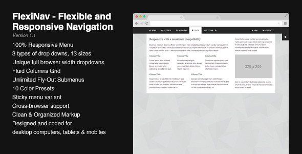
FlexiNav - Flexible and Responsive Navigation
Description


FlexiNav is the most flexible navigation system designed to work on any device. It is fully responsive and comes with 10 color presets.
This menu can be fixed at the top of the browser and has an optionnal trigger button to show or hide the menu bar. On mobile devices, the menu is put back into the flow of the page to make sure that all the content can be reached (fixed elements that don’t fit into a phone screen can’t be scrolled). If one menu isn’t enough, you can add others as you wish.
FlexiNav comes with a full set of drop downs sizes from fixed widths (12 sizes) to drop downs that can cover either the whole browser width or the whole menu bar width. Each drop down can independently stick to the left edge or to the right edge of its parent. In the same way, the menu bar can contain left aligned or right aligned items. All elements are resized down when viewed on a mobile device and the break points match the ones used in the Bootstrap framework.
If you have a lot of content to add into a given drop down, you have the possibility to use the custom scrollbars provided in the package. From a given height set in the script options, the script will automatically adjust the height of the drop down and the scrollbars.
FlexiNav includes a lot of styled elements such as headings, lists, lists with icons, form elements, etc. The font-awesome icon collection is already there to enhance your list elements. The CSS file is well structured and easy to customize : you can change the existing colors presets or create your owns. Images and videos will automatically take the available space so you don’t need to resize them manually.
The contact form included is quite simple and you only need to add your email address. The feedback messages appearing when a user sends an email can be changed or translated easily.
Features
- 100% Responsive navigation system
- Works well along with Bootstrap
- 3 types of drop downs (fixed width, mega and full browser width)
- Unique full browser width drop downs
- Sticky menu variant
- Flexible and 100% fluid columns grid
- Unlimited fly-outs
- Left or right alignment for the menu items and the drop downs
- Custom scrollbars
- Clean and professional design
- Fits into any layout
- Lots of styled elements (headings, lists, etc.)
- Font-awesome icon collection
- Designed for desktop computers, tablets and mobiles
- Simple and working contact form
Usages
- Standard Top Menu
- Sticky (or fixed) Top Menu
- Multiple Menus on a same page
- Collapsible Menus
- Responsive or Non-Responsive
What you get
For each version (responsive and non-responsive), you get 7 HTML files showing different possibilities or usages of this menu. All the code is organized, indented and easy to read. The script comes with an uncompressed version and a minified version.
The responsive and non-responsive versions are both included into separate folders.
Compatibility
FlexiNav has been tested on several devices and browsers to ensure a maximum compatibility : Internet Explorer, Firefox, Chrome, Opera, Safari have successfully passed the tests. Here’s a list of compatibility :
- Internet Explorer 8+
- Firefox
- Chrome
- Opera 11+
- Safari 4+
- Chrome on Android
- Safari on iPad and iPhone
Changelog
01/18/2014 – Version 1.1
- Improved the menu script
01/04/2014 – Version 1.0
- Initial Release
- 6 month free support included from author
- Free lifetime product updates guarantee
- 360 degrees quality control